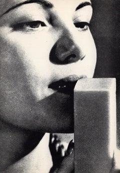
Performa x Barbara Kruger
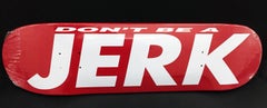
Don't Be a Jerk skateboard, 2017
Screenprint on skate deck
Unsigned
Edition of 100, unnumbered
31 × 8 inches
From the Barbara Kruger "The Drop" show at Performa 17 in NYC. which sold out. An ironic play on the logo of Supreme, Inc. with which Barbara Kruger had been in conflict. (a sort of inside joke, that we can now all be in on!) Created for Performa 2017 Biennial, this limited edition of 100 skate decks instantly became prized by collectors and skate enthusiasts. Kruger’s iconic typography translates a tongue-in-cheek commentary on commercial branding, cosmopolitan over-consumption and speaks to the societal role of artist as a resistant. Her concept for the Performa Commission and Biennial, is an activist aesthetic. Blending branding, public art, performance, commerce, and appropriation, Kruger triggers the issues of commercialization that often contaminate true craft, from fashion, to fine art. The skate decks were originally made available through "(Untitled) The Drop," part of Kruger’s city-wide performance for the Performa Biennial, which ran for the first three weeks of November. The Coleman Skatepark on the Lower East Side received a Kruger makeover, a billboard was erected on 17th Street and 10th Avenue, and a yellow school bus was transformed with Krugerisms like ‘Holy War’ ‘Class War’ ‘Bidding War’ and used to shuttle people from site to site. The artist also produced 50,000 limited edition Kruger MetroCards to be spat out by machines at random at certain stations. Supreme, which was famously derided by Kruger (as “a ridiculous clusterfuck of totally uncool jokers”) after it attempted to sue someone over imitating its own blatantly unoriginal branding, also made a MetroCard recently, causing chaos as people queued up with the hopes of purchasing one. In the end, the NYPD got involved.
About Barbara Kruger:
Barbara Kruger was born in 1945 in Newark, New Jersey. Kruger briefly attended Syracuse University, then Parsons School of Design in New York City, where she studied with artists and photographers Marvin Israel and Diane Arbus. Kruger worked in graphic design for Condé Nast Publications at Mademoiselle magazine, and was promoted to head designer within a year, at the age of twenty-two. Kruger has described her time in graphic design as “the biggest influence on my work…[it] became, with a few adjustments, my ‘work’ as an artist.”
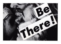
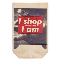
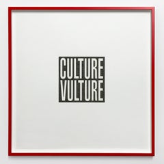
In the early 1970s, Kruger started showing artwork in galleries in New York. At the time, she was mainly working in weaving and painting. However, she felt that her artwork lacked meaning, and in 1976, she quit creating art entirely for a year. She took a series of teaching positions, including at University of California, Berkeley. When she began making art again in 1977, she had moved away from her earlier style into photo and text collages. In 1979, Kruger developed her signature style using large-scale black-and-white images overlaid with text. She repurposed found images, juxtaposing them with short, pithy phrases printed in Futura Bold or Helvetica Extra Bold typeface in black, white, or red text bars. In addition to creating text and photographic works, Kruger has produced video and audio works, written criticism, taught classes, curated exhibitions, designed products, such as T-shirts and mugs, and developed public projects, such as billboards, bus wraps, and architectural interventions.
Kruger addresses media and politics in their native tongue: sensational, authoritative, and direct. Personal pronouns like “you” and “I” are staples of Kruger’s practice, bringing the viewer into each piece. “Direct address has motored my work from the very beginning,” Kruger said. “I like it because it cuts through the grease.” Kruger’s work prompts us to interrogate our own positions; in the artist’s words, “to question and change the systems that contain us.” She demands that we consider how our identities are formed within culture, through representation in language and image.
- Courtesy of The Broad Museum