Johannes van Doetecum 1528-1605, Veelderleij niewe inventien van antijcksche sepultueren...Libro secundo (Surface decorations, grotesques with strapwork, including cartouches and funeral monuments), etching, New Hollstein 38, scholarship, import, bio, museum holdings, analysis
Johannes and Lucas van Doetecum, after Cornelis Floris II
Johannes van Doetecum I
Dutch, born 1528 or 1532, Deventer; died 1605, Haarlem
with Lucas van Doetecum
Dutch, active 1554–72; died before 1589
After Cornelis Floris II
Flemish, c. 1514–1575
Grotesque Ornament and Tomb Design
from Veelderleij niewe inventien van antijcksche sepultueren … Libro secundo
(Various New Inventions of Antique Tombs … Second Book)
1557
Etching and engraving on laid paper
Published by Hieronymus Cock, Antwerp
Approximately 30.4 × 20.8 cm
New Hollstein 38 (Van Doetecum)
From a series of sixteen plates
Catalogue entry
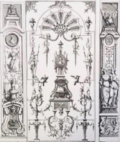
This remarkably elaborate design for an imaginary funerary monument belongs to one of the most influential ornament series produced in sixteenth-century Antwerp. Although frequently catalogued under Johannes van Doetecum alone, the series is more accurately attributed jointly to the brothers Johannes and Lucas van Doetecum, working after designs by the Antwerp architect and sculptor Cornelis Floris II. It was issued in 1557 by Hieronymus Cock, the leading Netherlandish publisher of architectural and ornamental prints.
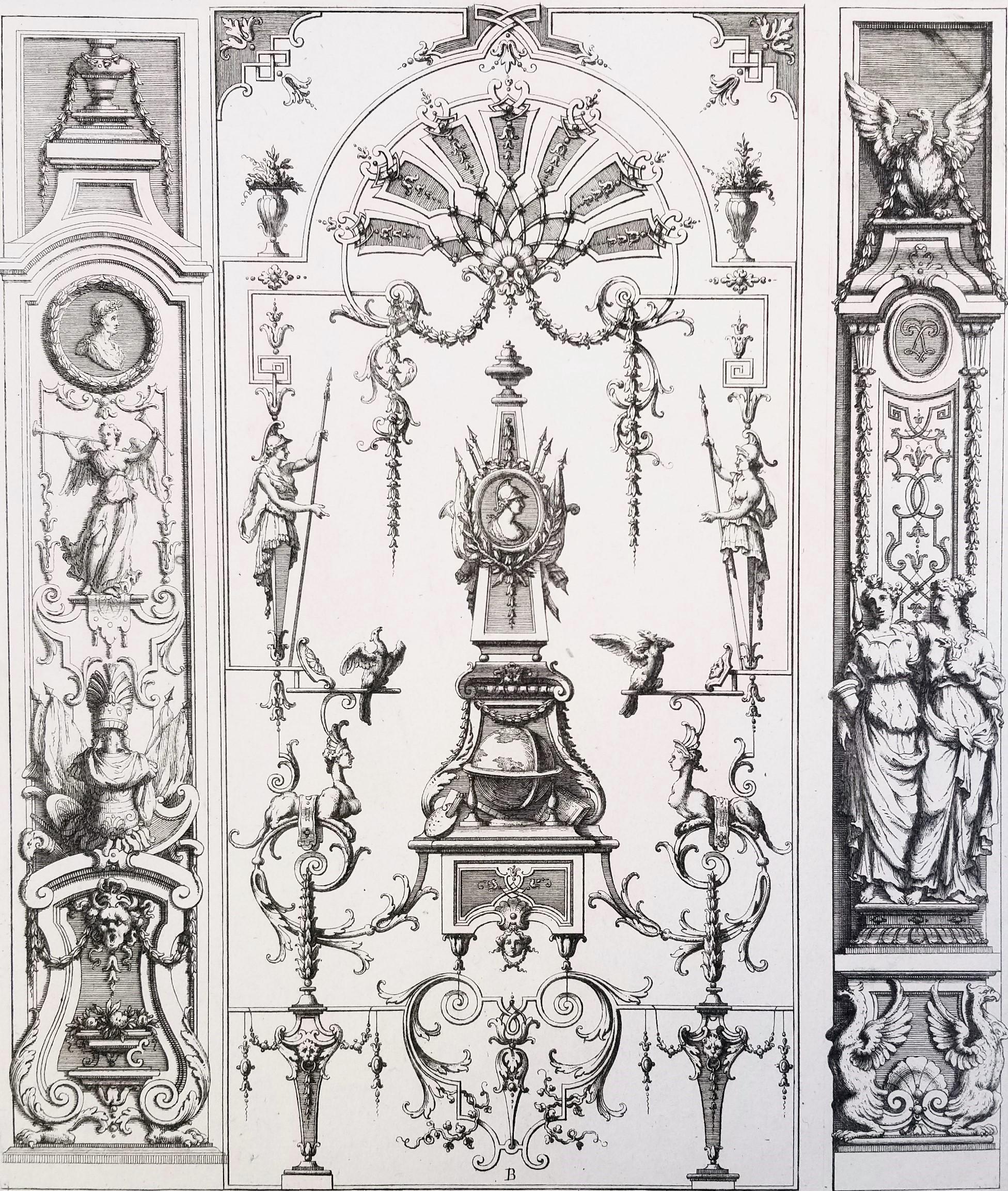
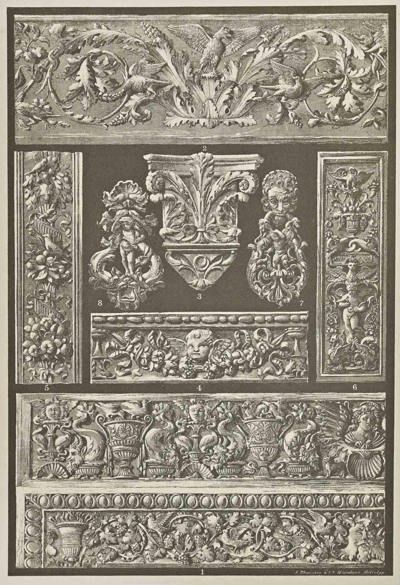
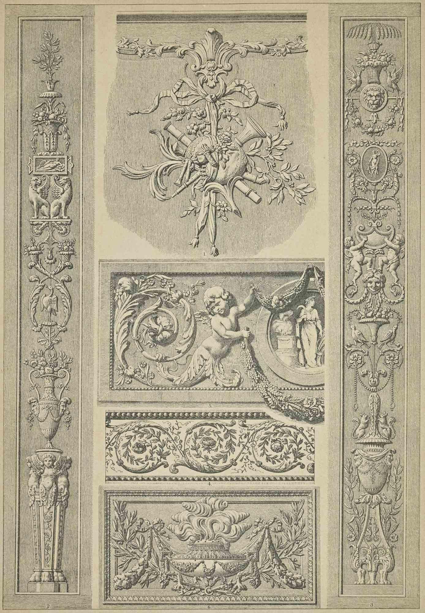
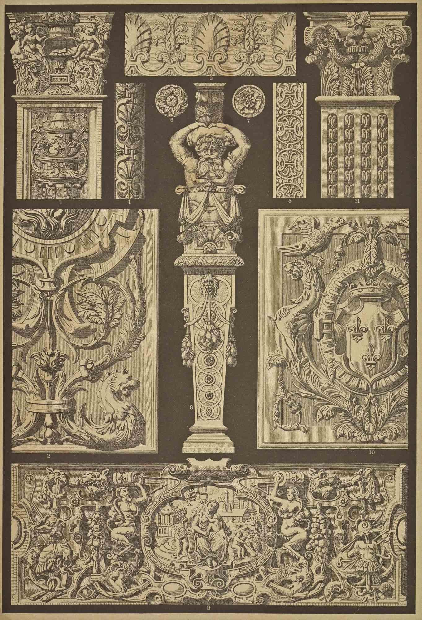
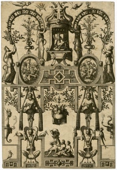
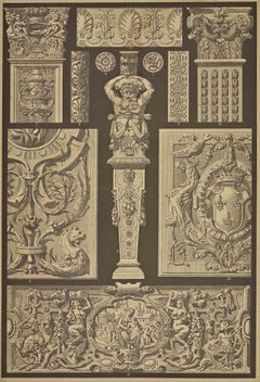
The extended title identifies the publication’s practical purpose. Its “new inventions” of antique tombs, grotesques and compartments were described as suitable for sculptors, stonecutters, painters and “all artists.” The plates were therefore not merely autonomous fantasies. They constituted a portable repertory of forms that craftsmen could consult, adapt and recombine in tombs, façades, furniture, metalwork, stained glass, book illustration and temporary festival architecture.
The present composition, New Hollstein 38, is among the most extravagant plates in the series. Its structure resembles a monumental domed mausoleum, but nearly every architectural element has been transformed into something animate, suspended or deliberately improbable. Enormous curving supports rise from a stepped circular platform and converge around a cage-like dome. Their sweeping profiles suggest architectural ribs, scythes, tusks and fantastic organic limbs simultaneously. The design thus oscillates between a plausible monument and a decorative apparition.
Analysis
At the center, a nude male figure is suspended beneath the upper canopy with his arms extended. Although his pose inevitably recalls the Crucifixion, the figure exists within a paganizing decorative ensemble rather than a conventional Christian narrative. Below him are masks, urns, trophies, garlands and small figures distributed across the structure. Putti occupy ledges and curved supports; classical or allegorical figures stand beside vessels; birds with exaggerated beaks and ornamental tail feathers animate the upper corners. Other creatures carry branches and suspended fruit, blurring the boundaries between animal life, botanical ornament and architectural framework.
The nude figure should therefore be understood principally as an ornamental ignudo—a human body employed as a structural and expressive component—although its cruciform pose introduces a deliberately provocative sacred association. Such ambiguous imagery was characteristic of the Renaissance grotesque, in which classical, Christian and fantastic motifs could coexist without forming a single, literal narrative.
The monument’s apparent symmetry is continually disrupted by incident. Paired birds and figures establish a broad equilibrium, but their postures, attributes and surrounding details vary. The eye moves from the procession-like figures on the lower steps upward through standing personifications, hanging trophies and reclining putti to the suspended central nude and finally to the flowering finial. This vertical movement gives the design the character of a theatrical ascent—from earthly procession and commemoration toward an elevated, fantastical realm.
The open dome is particularly inventive. It evokes a trellis, aviary, celestial sphere and architectural cupola at once. Branches penetrate and surround its ribs, implying that organic growth has overtaken built form. Floris consequently presents architecture not as fixed masonry but as a flexible ornamental language capable of metamorphosis.
The design’s spatial contradictions were purposeful. Few viewers would have believed that this top-heavy structure could actually be constructed. Its value lay instead in its abundance of transferable ideas: a sculptor might borrow a terminal figure, an architect the curved framework, a metalworker the hanging trophies, or a painter the combinations of foliage, birds and masks. The print is best understood as an inventory of possibilities compressed into the fiction of a tomb.
Cornelis Floris and the “Floris style”
Cornelis Floris II—also known as Cornelis de Vriendt—was among the principal agents through whom Italian Renaissance and Mannerist ornament entered northern European architecture. Born into an Antwerp family of artists, he developed a highly recognizable ornamental vocabulary combining Italian grotesques with Netherlandish strapwork, cartouches, masks, herms, fruit, foliage and muscular human figures.
Floris’s designs did not simply imitate Italy. They transformed classical ornament into a denser, more sculptural and often more fantastic northern idiom. The resulting “Floris style” spread through the Netherlands, Germany, Scandinavia, England and the Baltic region. Its international reach depended heavily upon printed series such as Veelderleij niewe inventien. Through Cock’s publishing network, motifs conceived in Antwerp became available to craftsmen who would never have encountered Floris’s buildings or sculptures directly.
The title Libro secundo deliberately invokes the authority of Italian architectural publications. Yet the language of the title is largely Dutch, demonstrating that the publication was aimed at the practical northern European workshop as well as at sophisticated collectors of architectural invention.
Johannes and Lucas van Doetecum
Johannes, or Jan, van Doetecum was born at Deventer in either 1528 or 1532. By 1554 he and his brother Lucas were working in Antwerp, principally for Hieronymus Cock’s publishing house, In de Vier Winden—“At the Four Winds.” Their early prints are rarely signed individually, making a precise division of labor between the brothers difficult. Modern scholarship therefore generally treats many Antwerp-period plates as collaborative productions.
The Van Doetecums translated designs by Pieter Bruegel the Elder, Cornelis Floris, Hans Vredeman de Vries and other leading Netherlandish artists into print. Their subjects included landscapes, architectural perspectives, ornamental designs, ruins, maps and topographical views. Following the political and religious disruptions in the Netherlands, Johannes returned north. He later worked with his sons and became particularly important in cartographic engraving, producing maps and nautical charts associated with the expansion of Dutch exploration and commerce.
The brothers developed an unusually refined combination of etching and engraving. Most of the principal forms were drawn rapidly and fluidly through etching, while engraved lines and retouching supplied definition, deeper shadows and tonal gradation. Their results could resemble the precision of line engraving while retaining the freedom and economy of etching. This technical distinction is important here: although the sheet is sometimes described simply as an etching, “etching and engraving” is the more complete medium designation.
Scholarly importance
Older scholarship often regarded the Van Doetecums merely as reproductive craftsmen. More recent studies—especially those by Timothy Riggs and Henk Nalis—have restored their importance as inventive interpreters whose technique was essential to the appearance and dissemination of Netherlandish Mannerism.
The standard modern reference is:
Henk Nalis, The New Hollstein Dutch & Flemish Etchings, Engravings and Woodcuts, 1450–1700: The Van Doetecum Family, edited by Ger Luijten and Christiaan Schuckman, Rotterdam, 1998, Part I: The Antwerp Years, 1554–1575.
The four-volume catalogue expanded the known Van Doetecum corpus dramatically and clarified many previously anonymous or publisher-attributed prints. It also established the distinctive collaboration of etching and engraving that had allowed the brothers’ work to be confused with conventional engraving. The present plate is catalogued as New Hollstein 38. The British Museum also cites the earlier references to the series under Cornelis Floris and Hieronymus Cock.
The sixteen-sheet 1557 publication followed earlier related Floris ornament sets issued in 1554 and 1556. Together, these publications show Cock developing the ornament print into a serial, commercially distributed design resource. Complete early sets are scarce; individual impressions were frequently separated, trimmed or handled extensively in workshops. A Christie’s sale of material from the Arthur and Charlotte Vershbow collection described plates from the 1557 set as “extremely rare,” reflecting the difficulty of assembling substantial groups today. Christie’s
Museum holdings
Confirmed institutional impressions of New Hollstein 38 include:
Blanton Museum of Art, University of Texas at Austin, Leo Steinberg Collection, object 2002.2068. The museum identifies both Johannes and Lucas van Doetecum, dates the plate 1557, and specifically catalogues it as New Hollstein 38. Blanton Museum
British Museum, London, registration M,38.89. The impression is described as an ornament design for a tomb or mausoleum from Libro secundo, made by Johannes and Lucas van Doetecum after Cornelis Floris and published by Hieronymus Cock. British Museum
Major institutional holdings of the 1557 series, including related plates and substantial or complete groups, include:
Metropolitan Museum of Art, New York, Harris Brisbane Dick Fund, 1926. The museum describes the publication as a series of sixteen tomb and ornament designs after Floris, executed by Johannes and Lucas and published by Cock. One catalogued sheet measures 30.8 × 20.7 cm, closely corresponding to the format of the present plate. Metropolitan Museum of Art
British Museum, London, which possesses multiple impressions and records at least two impressions of certain plates in the series.
Blanton Museum of Art, Austin, especially strong in Netherlandish ornament prints through the Leo Steinberg Collection.
Art Institute of Chicago, which holds closely related Van Doetecum–Floris grotesque and tomb designs from the successive 1556–57 publications. Art Institute of Chicago
Because museum databases sometimes assign shortened or translated titles—and sometimes conflate the related 1556 and 1557 Floris series—holdings should be verified by New Hollstein number and image, rather than by English title alone.
Significance
New Hollstein 38 is important on several levels. It is a superb example of Cornelis Floris’s transformation of classical grotesque ornament into a distinctly northern Mannerist language; a demonstration of the Van Doetecums’ sophisticated etched-and-engraved technique; and evidence of Hieronymus Cock’s pivotal role in turning printed ornament into an international medium of artistic exchange.
What appears at first to be an eccentric fantasy was, in fact, an exceptionally effective instrument of design transmission. Its hybrid monument—part tomb, cage, theatre, garden structure and pagan-Christian allegory—embodies the fundamental principle of the grotesque: invention generated through unrestricted combination. The sheet offered sixteenth-century craftsmen not a building to copy literally, but a visual vocabulary from which new objects could be imagined.