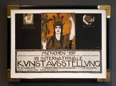
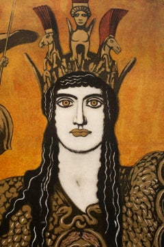
Franz von Stuck Art

1863-1928

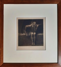
Franz von Stuck was a German artist of exceptional skills as a painter, sculptor, engraver, photographer, and draughtsman. He was born in Tettenweis, Germany, in 1863. He was a member-founder of the Munich Secession in 1893, and together with other artists, he was a forerunner of the Art Nouveau experience, called Jugendstil in Germany. Thanks to his style of formal perfection, sensuality and decadent sensitivity, he seduced the art world of half Europe. Von Stuck was particularly successful in Italy, to such an extent that he was granted a solo show at the Venice Biennial of 1909. His figurative repertory derived from classical art centaurs, fauns, nymphs drawn from antique mythology in the wake of a tradition inaugurated by Arnold Böcklin and was mediated through a fin-de-siècle sensibility towards eroticism and artfulness.

to
1
1
Overall Width
to
Overall Height
to
1
1
2
2
2
1
1
1
1
1
4
11,084
2,852
2,494
1,431
1
1
1
1
Artist: Franz von Stuck
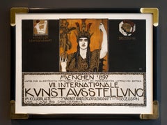
Art Nouveau "Poster for Kunstavsstellung VII" by Fraz von Stuck

Art Nouveau "Poster for Kunstavsstellung VII" by Fraz von Stuck

By Franz von Stuck

Located in Palm Beach, FL

Note: We highly recommend shipping through 1stDibs for its cost effectiveness, full insurance coverage, and reliable handling. While standard parcel services are an option, the defau...

Category

1890s Art Nouveau Franz von Stuck Art

Materials

Lithograph

Related Items
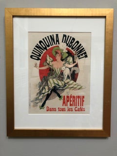
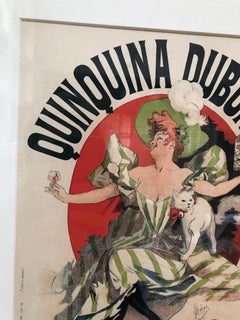
"Quinquina Dubonnet" Original Jules Cheret Maitre de l'Affiche

"Quinquina Dubonnet" Original Jules Cheret Maitre de l'Affiche

By Jules Chéret

Located in Hinsdale, IL

CHERET, JULES (1836 - 1932) "Quinquina Dubonnet" Original lithograph from “Les Maitres de L’Affiche” series Printed by Imprimerie Chaix, Paris Bearing MDL stamp lower right, from issue #28, 1898. Plate #109 Unframed Size: 11 3/8 x 15 3/4” The “Les Maitres de l’Affiche” series was offered as a subscription series to collectors every month for 60 months, from December 1895 through November 1900. The “Maitres de l’Affiche,” were issued as separate numbered sheets, referred to as “plates”. They were numbered, with the printers name “Imprimerie Chaix,” in the margin at the bottom left hand corner, “PL.1” to “PL.240.” In the margin at the bottom right hand corner of each, is a blind embossed stamp from a design of Cheret’s. The smaller format and the fact the “Maitres” were a paid subscription series, allowed Imprimerie Chaix to use the latest state of the art printing techniques, not normally used in the large format posters due to cost. A very high quality of paper was used, where as the large format posters were printed on lesser quality newsprint, due to cost and a short expected life span. This explains why the quality of the printing, in the “Maitres de l’Affiche,” usually far exceeds that of their larger counterparts. “The Dubonnet poster...

Category

1890s Art Nouveau Franz von Stuck Art

Materials

Lithograph

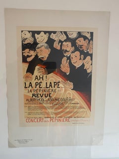
"Ah! la Pe . . . la Pe . . . la Pepiniere" from Les Maitres de l'Affiche

"Ah! la Pe . . . la Pe . . . la Pepiniere" from Les Maitres de l'Affiche

By Félix Vallotton

Located in Hinsdale, IL

VALLOTTON, F. (1865 - 1925) "Ah! la Pe . . . la Pe . . . la Pepiniere" Original lithograph from “Les Maitres de L’Affiche” series Printed by Imprimerie Chaix, Paris Bearing MDL stam...

Category

1890s Art Nouveau Franz von Stuck Art

Materials

Lithograph

Le Fondeur Paris  [Steel Worker]

Le Fondeur Paris [Steel Worker]

By Eugène Carrière

Located in New York, NY

Carriere, Eugene. Le Fondeur, Paris 1900 [Steel Worker], Color lithograph. Ref: Das Fruhe Plakat 134. 51 x 34 3/4 inches. Eugène Anatole Ca...

Category

Early 1900s Symbolist Franz von Stuck Art

Materials

Lithograph

Antoine Georges Marie Rochgrosse

Antoine Georges Marie Rochgrosse

By Georges Antoine Rochegrosse

Located in New York, NY

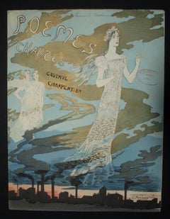
Rochgrosse, Antoine Georges Marie. Poems Chantes/Gustave Carpentier /Paris/Henri Tellier, Editeur. 1896. 7 Color lithograph. Das fruhe Plakat 750 (Music Sheet). French painter, pri...

Category

1880s Symbolist Franz von Stuck Art

Materials

Lithograph

La Fille au Violon
La Fille au Violon

La Fille au Violon

By Alexandre Charpentier

Located in Fairlawn, OH

La Fille au Violon Color lithograph, gypsograph with embossed publisher's stamp Signed and numbered in ink (see photo) From: L'Estampe Originale, Paris, Vol. VII Published by Andre M...

Category

1890s Art Nouveau Franz von Stuck Art

Materials

Lithograph

"Grande Tuilerie d’Ivry" from Les Maitres de l'Affiche

"Grande Tuilerie d’Ivry" from Les Maitres de l'Affiche

By Alexandre Charpentier

Located in Hinsdale, IL

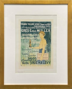
CHARPENTIER, ALEX (1856 -1909) "Grande Tuilerie d’Ivry" Original lithograph from "Les Maitres de L'Affiche" series Printed by Imprimerie Chaix, Paris Bearing MDL stamp lower right, issue # 33, 1898. Plate #131 Unframed Size: 11 3/8 x 15 3/4”The "Les Maitres de l'Affiche" series was offered as a subscription series to collectors every month for 60 months, from December 1895 through November 1900. The "Maitres de l'Affiche," were issued as separate numbered sheets, referred to as "plates". They were numbered, with the printers name "Imprimerie Chaix," in the margin at the bottom left hand corner, "PL.1" to "PL.240." In the margin at the bottom right hand corner of each, is a blind embossed stamp from a design of Cheret's. The smaller format and the fact the "Maitres" were a paid subscription series, allowed Imprimerie Chaix to use the latest state of the art printing techniques, not normally used in the large format posters due to cost. A very high quality of paper was used, where as the large format posters were printed on lesser quality newsprint, due to cost and a short expected life span. This explains why the quality of the printing, in the "Maitres de l'Affiche," usually far exceeds that of their larger counterparts. The text reads "Great Tileworks of Ivry, founded in 1854, Ivry-Port near Paris; the largest ceramics factory in the world for building, industry and art productions; Emille Muller stoneware; execution of works by masters of statuary; architectural facings; decorative sculpture; showroom and salesroom, 3 rue Halevy; the only tile able to bear the names Muller and Ivry; (tiles) guaranteed against frost" Given the commission for an extremely text heavy poster, the artist executes a masterful design. The angelic young boy holds the wares of this famous ceramics factory, against an abstract background awash in organic green hues. The handling of the immense text that flows from top to bottom in every available space shows great artistic skill, as the overall beauty of the design is intact. In 1989 the Metropolitan Museum of art acquired a stoneware plaque...

Category

1890s Art Nouveau Franz von Stuck Art

Materials

Lithograph

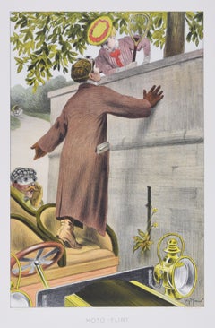
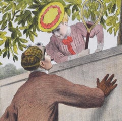
Moto-Flirt
Moto-Flirt

Moto-Flirt

By Georges Meunier

Located in Fairlawn, OH

Moto-Flirt Color lithograph, c. 1902 Signed in the stone lower right (see photo) Published by Edmund Sagot (1857-1917), Paris Printed by Atelier Chaix, Paris Large edition with title...

Category

Early 1900s Art Nouveau Franz von Stuck Art

Materials

Lithograph

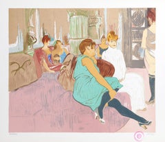
Salon, Art Nouveau Lithograph after Henri Toulouse-Lautrec

Salon, Art Nouveau Lithograph after Henri Toulouse-Lautrec

Located in Long Island City, NY

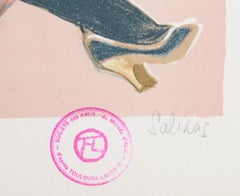
Laurent Marcel Salinas, After Toulouse-Lautrec, Egyptian/French (1913 - 2010) - Salon, Year: circa 1977, Medium: Lithograph on Arches, Museum Stamped and numbered in pencil, Editio...

Category

1970s Art Nouveau Franz von Stuck Art

Materials

Lithograph

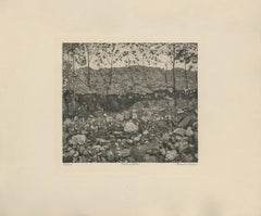
"Mountain Stream" Copper Plate Heliogravure

"Mountain Stream" Copper Plate Heliogravure

By Ferdinand Hodler & R. Piper & Co.

Located in Palm Beach, FL

2018 marks the centenary anniversary of Ferdinand Hodler’s death. In that 100 years time, the art world’s esteem of this important artist has proved fickle. It has shifted from extolling his artistic merits during his lifetime to showing something of a feigned disdain- more reflective of the world political order than a true change of heart for Hodler’s work. After years of Hodler being all but a footnote in the annals of art history and generally ignored, finally, the pendulum has righted itself once again. Recent retrospective exhibitions in Europe and the United States have indicated not only a joyful rediscovery of Hodler’s art but a firm conviction that his work and world view hold particular relevance today. DAS WERK FERDINAND HODLERS is not only a collection of printed work reflecting the best of all of his painted work created up to 1914 just before the outbreak of World War I, the portfolio itself is an encapsulation of Hodler’s ethos, Parallelisme. Hodler developed his philosophy of Parallelisme as a unifying approach to art which strips away detail in search of harmony. By means of abstraction, symmetry and repetition, Hodler sought ways to depict Nature’s essence and her fundamental, universal order. He believed these universal laws governing the natural, observable world extend to the spiritual realm. Symbolist in nature with Romantic undertones, his works are equally portraits of these universal concepts and feelings governing all life as they are a visual portrait in the formal sense. Whether his subject is a solitary tree, a moment in battle, mortal fear, despair, the awe inspired by a vast mountain range, a tender moment or even the collective conviction in a belief, Hodler unveils this guiding principle of Parallelisme. Several aspects of Hodler’s portfolio reinforce his tenets of Parallelisme. The Table of Contents clearly preferences a harmonious design over detail. The two columns, consisting of twenty lines each, list the images by order of appearance using their German titles. The abbreviated titles are somewhat cryptic in that they obscure the identities of the sitters. Like the image Hodler presents, they are distillations of the sitter without any extraneous details. This shortening was also done in an effort to maintain a harmonious symmetry of the Table of Contents, themselves, and keep titles to a one-line limit. The twenty-fourth title: “Bildnis des Schweizerischen Gesandten C.” was so long, even with abbreviation, that it required two lines; so, for the sake of maintaining symmetry, the fortieth title: “Bauernmadchen” was omitted from the list. This explains why the images are not numbered. Hodler’s reasoning is not purely esoteric. Symmetry and pattern reach beyond mere formal design principles. Finding sameness and imposing it over disorder goes to the root of Hodler’s identity and his art. A Swiss native, Hodler was bi-lingual and spoke German and French. Each printed image, even number forty, have titles in both of Hodler’s languages. Certainly, there was a market for Hodler’s work among francophones and this inclusion may have been a polite gesture to that end; however, this is the only place in the portfolio which includes French. With German titles at the lower left of each image, Hodler’s name at bottom center and corresponding French titles at the lower right of each image, there is a harmony and symmetry woven into all aspects of the portfolio. This holds true for the page design, as it applies to each printed image and as it describes the Swiss artist himself. Seen in this light, Hodler’s portfolio of printed work is the epitome of Hodler’s Parallelisme. DAS WERK FERDINAND HODLERS is also one of the most significant documents to best tell the story of how Hodler, from Switzerland, became caught between political cross-hairs and how the changing tides of nations directly impacted the artist during his lifetime as well as the accessibility of his art for generations to come. The Munich-based publisher of the portfolio, R. Piper & Co., Verlag, plays a crucial role in this story. Publishing on a wide range of subjects from philosophy and world religion to music, literature and the visual arts; the publisher’s breadth of inquiry within any one genre was equal in scope. Their marketing strategy to publish multiple works on Hodler offers great insight as to what a hot commodity Hodler was at that time. R.Piper & Co.’s Almanach, which they published in 1914 in commemoration of their first ten years in business, clearly illustrates the rapid succession- strategically calculated for achieving the deepest and broadest impact - in which they released three works on Hodler to hit the market by the close of 1914. DAS WERK FERDINAND HODLERS was their premier publication. It preceded C.A. Loosli’s Die Zeichnungen Ferdinand Hodlers, a print portfolio after 50 drawings by Hodler which was released in Autumn of 1914 at the mid-level price-point of 75-150 Marks; and a third less expensive collection of prints after original works by Hodler, which had not been included in either of the first two portfolios, was released at the end of that year entitled Ferdinand Hodler by Dr. Ewald Bender. The title and timing of DAS WERK FERDINAND HODLERS' debut leaves little doubt as to the connection it has with another avant-garde portfolio of art prints, Das Werk Gustav Klimts, released in 5 installments from 1908 -1914 by Galerie Miethke in Vienna. Hodler, himself, was involved in Klimt’s ground-breaking project. As the owner of Klimt’s 1901 painting, “Judith with the Head of Holifernes” which appears as the ninth collotype print in the second installment of Das Werk Gustav Klimts, Hodler was obliged to grant access of the painting to the art printers in Vienna for them to create the collotype sometime before 1908. Hodler had been previously invited in 1904 to take part in what would be the last exhibition of the Vienna Secession before Klimt and others associated with Galerie Miethke broke away. In an interview that same year, Hodler indicated that he respected and was impressed by Klimt. Hodler’s esteem for Klimt went beyond the art itself; he emulated Klimt’s method aimed at increasing his market reach and appeal to a wider audience by creating a print portfolio of his painted work. By 1914, Hodler and his publisher had the benefit of hindsight to learn from Klimt’s Das Werk publication. Responding to the sluggish sales of Klimt’s expensive endeavor, Hodler’s publisher devised the same diversified 1-2-3 strategy for selling Hodler’s Das Werk portfolio as they did with regards to all three works on Hodler they published that year. For their premium tier of DAS WERKS FERDINAND HODLERS, R. Piper & Co. issued an exclusive Museum quality edition of 15 examples on which Hodler signed each page. At a cost of 600 Marks, this was generally on par with Klimt’s asking price of 600 Kronen for his Das Werk portfolio. A middle-tiered Preferred edition of 30, costing somewhat less and with Hodler’s signature only on the Title Page, was also available. The General edition, targeting the largest audience with its much more affordable price of 150 Marks, is distinguishable by its smaller size. Rather than use the subscription format Miethke had chosen for Klimt’s portfolios which proved to have had its challenges, R. Piper & Co. employed a different strategy. In addition to instantly gratifying the buyer with all 40 of the prints comprising DAS WERK FERDINAND HODLERS and the choice among three price points, they advertised in German journals a fourth possibility of ordering single prints from them directly. These printed images are easily discernible from the three complete folio editions. The paper size of the single purchased images is of the larger format like the Museum and Preferred editions, measuring 65 h x 50 w cm; however, the paper itself is the same copper print paper used in the General edition and then mounted on poster board. The publishing house positioned itself to be a direct retailer of Hodler’s art. They astutely recognized the potential for profitability and the importance, therefore, of having proprietary control over his graphic works. R. Piper & Co. owned the exclusive printing rights to Hodler’s best work found in their three publications dating from 1914. That same year, a competing publication out of Weimar entitled Ferdinand Hodler: Ein Deutungsversuch von Hans...

Category

1910s Symbolist Franz von Stuck Art
Materials

Paper

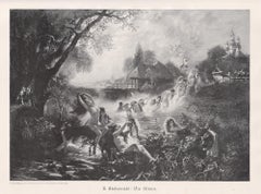
Die Nixen (Mermaids), nudes, German antique engraving

Die Nixen (Mermaids), nudes, German antique engraving

By Virgilio Tojetti

Located in Melbourne, Victoria

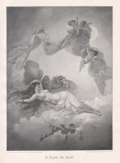
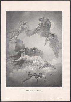
'Die Nixen' (Mermaids) German wood-engraving, 1903. 230mm by 320mm (image) 280mm by 410mm (sheet)

Category

Early 20th Century Symbolist Franz von Stuck Art

Materials

Engraving

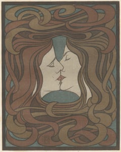
Der Kuss  The Kiss (plate facing page 116)

Der Kuss The Kiss (plate facing page 116)

By Peter Behrens

Located in Fairlawn, OH

Der Kuss The Kiss (plate facing page 116) Color lithograph, 1898 Signed with the artist's initials in the image (see photo) Published in Pan, Volume IV.2 (Jul-Aug-Sept 1898) Publishe...

Category

1890s Art Nouveau Franz von Stuck Art

Materials

Lithograph

Previously Available Items
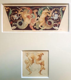
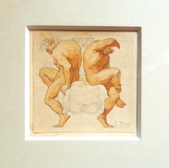
Grotesque with Fighting Centaurs - Pencil and Watercolor by F. von Stuck

Grotesque with Fighting Centaurs - Pencil and Watercolor by F. von Stuck

By Franz von Stuck

Located in Roma, IT

Grotesque with Fighting Centaurs includes two original drawings in watercolor and pencil on cardboards in one bamboo frame, realized by Franz Von Stuck proba...

Category

Early 20th Century Symbolist Franz von Stuck Art

Materials

Watercolor, Pencil

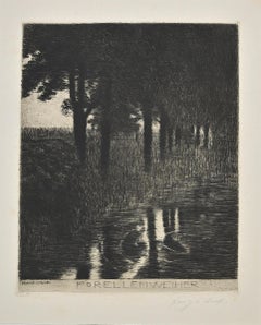
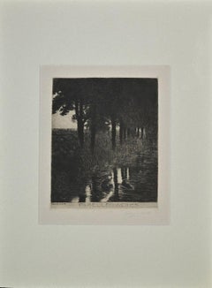
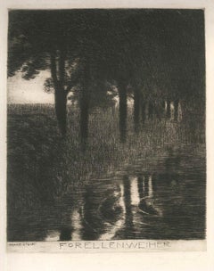
Forellenweiher
Forellenweiher

Forellenweiher

By Franz von Stuck

Located in Roma, IT

Wonderful black and white etching and drypoint on wide rod cream paper. Hand signed in graphite on the lower right: "Franz v Stuck" (lightly discolored) and signed on plate on the lo...

Category

1890s Modern Franz von Stuck Art

Materials

Etching

POSTER FOR VII INTNL ART EXHIBITION OF MUNICH ARTISTS ASSOCIATION & SECESSION

POSTER FOR VII INTNL ART EXHIBITION OF MUNICH ARTISTS ASSOCIATION & SECESSION

By Franz von Stuck

Located in Palm Beach, FL

FRANZ VON STUCK, POSTER FOR VII. INTERNATIONALE KUNSTAUSSTELLUNG MÜNCHNER KÜNSTLERGENOSSENSCHAFT UND SECESSION (VII INTERNATIONAL ART EXHIBITION OF THE MUNICH ARTISTS ASSOCIATION AN...

Category

1890s Jugendstil Franz von Stuck Art

Materials

Lithograph

Franz Von Stuck art for sale on 1stDibs.

Find a wide variety of authentic Franz von Stuck art available for sale on 1stDibs. You can also browse by medium to find art by Franz von Stuck in bronze, drypoint, engraving and more. Not every interior allows for large Franz von Stuck art, so small editions measuring 15 inches across are available. Customers who are interested in this artist might also find the work of Edvard Munch, Odilon Redon, and Franz von Bayros (Choisi Le Conin). Franz von Stuck art prices can differ depending upon medium, time period and other attributes. On 1stDibs, the price for these items starts at $4,011 and tops out at $149,500, while the average work can sell for $76,755.

Artists Similar to Franz von Stuck